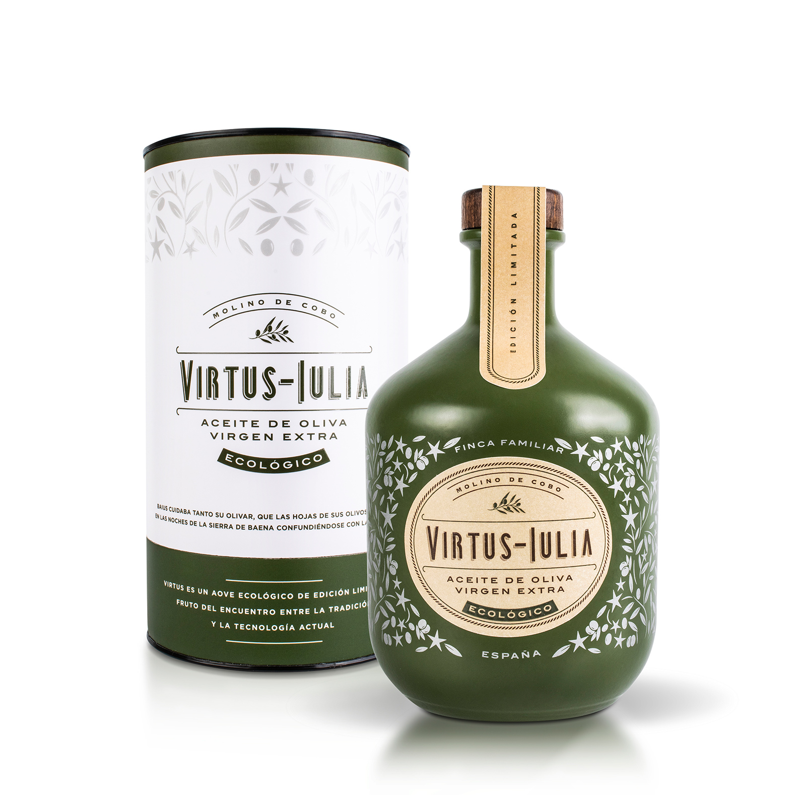
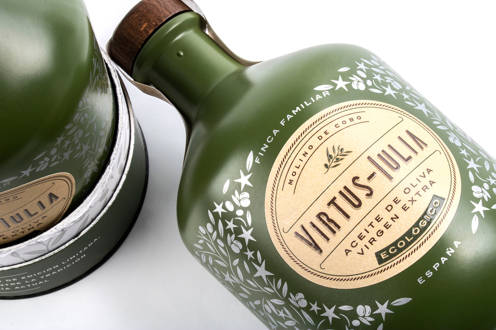
The design is perfectly connected to the storytelling of the brand. The bottle has a sinuous shape somewhat reminiscent of ancient containers from the Roman period. In the process of decorating the bottle, we chose to paint it with a powerful and elegant matt green color. This green evokes the finish of the clay materials of the time, unites the intense extra virgin from the beginning of October with its range and distances itself from other greens used in the sector.
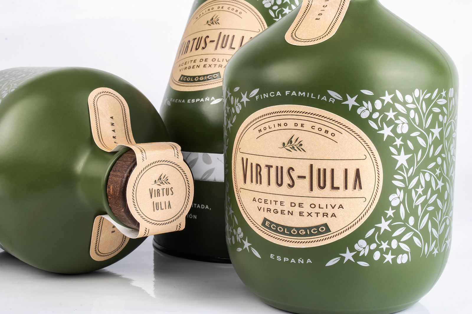
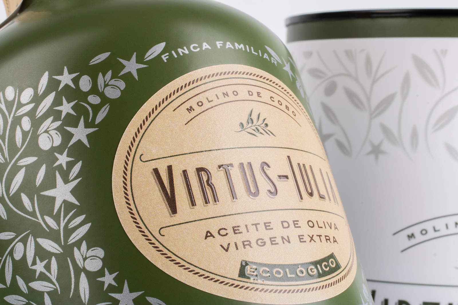
We illustrate the bottle by means of a graphic with an original motif that we apply by means of silk-screen printing in silver colour. This unites oil, olive groves and the concept of nature, highlighting the history of storytelling and identifying the product. In the drawing of the illustration, we combine silver olive leaves that are incorporated together with the stars in an enveloping way embracing the bottle. Evoking the olive leaves that shine and confuse the starry nights of Baena. On its front, it opens an ellipse-shaped space that will house the label where the combination of colors creates a perfect marriage between the materials of the historical period and the product’s marketing image: green, silver, terracotta, and brown.
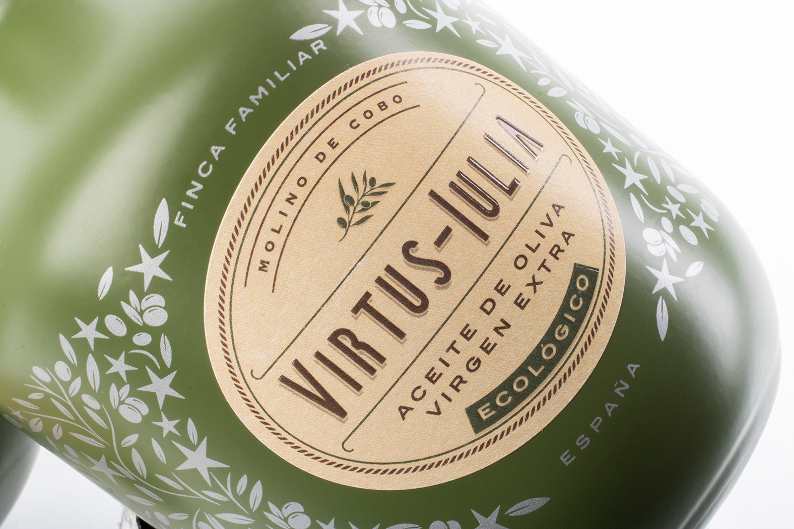
The graphic design of the labels maintains a harmonic balance, with a premium and minimal style. Each communication element has the correct visual weight. The modern logo integrates with the ancient world, through a San Serif with capital letters that evoke the writing of the time, without losing sight of the contemporary and enhancing the concept of the Virtus Iulia naming.
The elegant icon of the olive branch, together with the fine fretwork that frames the label, provide a style reminiscent of the symbolism and culture that ancient Rome bequeathed us. The general image of the brand is a brand with a premium and modern appearance, with a strong and recognizable image for the consumer.
To achieve a premium image of the Virtus Iulia olive oil packaging on the bottle, we have taken into account the details and finishes, as well as ensuring that the materials are as respectful as possible with the environment in the different elements that make up the container. In the labeling, we have used a Tintoretto Gesso Grease Proof that prevents stains on contact with olive oil and can be cleaned perfectly. Its delicate texture is highlighted with the brown color and the brand acquires power with the terracotta color under the relief silk-screen varnish that finishes off its details.
It is difficult to place the label as it has a position since it must be placed in the front hole of the screen printing, but the visual result of the combination of label and screen printing makes the difference. To complete the finish of the packaging we have used a closure cap with a built-in spout made of wood painted in a wenge tone. On which we add a guarantee seal that communicates the pluses of organic extra virgin olive oil. The legal back label is manufactured on the same support as the set, forming a visual unit.