In a world where first impressions matter more than ever, the power of packaging design cannot be overstated. It’s often the initial encounter that draws us in, sparking curiosity and interest in what lies beneath the surface. And when it comes to vegan products, this principle holds true with even greater significance.
While the appeal of plant-based goods primarily targets those who have embraced a cruelty-free lifestyle, the importance of attractive vegan packaging design extends far beyond the boundaries of dietary choices. In fact, it has the potential to captivate even the most steadfast meat-eaters, beckoning them to explore and indulge in a world they may never have considered before. Let’s delve into the art and science behind the allure of vegan packaging with these 10 packaging design, it can transcend dietary preferences to make converts out of the unlikeliest of consumers.
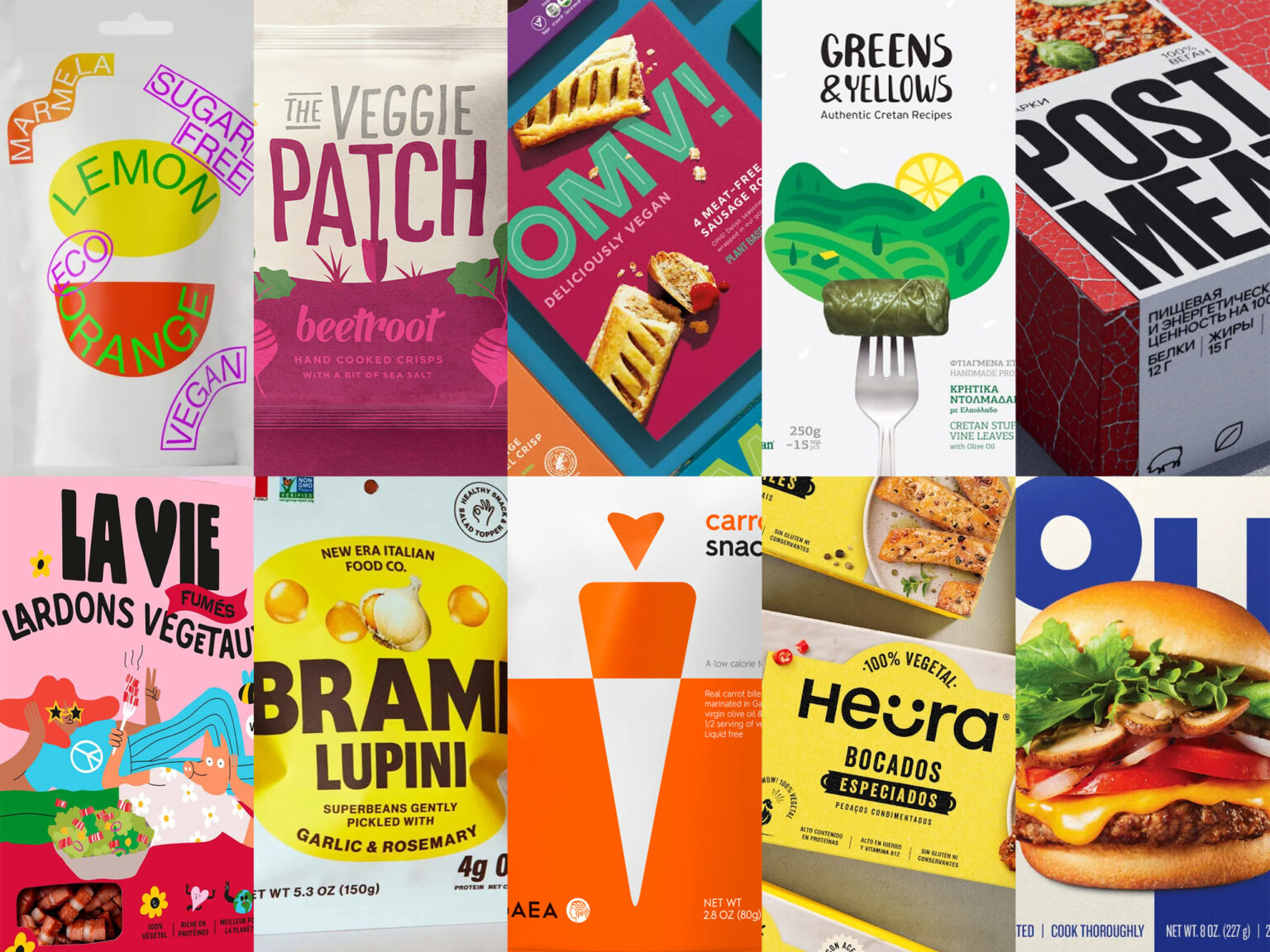
OMV! DELICIOUSLY VEGAN by OURCREATIVE
OMV! represents a modern and bold sub-brand designed to appeal to a wide audience, including Vegans, Flexitarians, and meat reducers. Its vibrant and eye-catching branding, complemented by striking photography, targets a younger demographic. With its unapologetically bold brandmark, adaptable color palette, and shelf presence, OMV! ensures it stands out on the market.
GREENS N YELLOWS by LAZY SNAIL DESIGN
Drawing inspiration from the natural ingredients abundant in Crete, LAZY SNAIL DESIGN crafted a brand that embodies nature, innocence, and honesty. The packaging design aims to recreate the authentic Cretan dining experience, with a focus on mouthwatering realism and vibrant colors.
GAEA VEGAN SNACKS by MOUSEGRAPHICS
Each vegetable (carrot, gherkin, cauliflower) serves as an emblem against a backdrop of two vibrant color zones. Vital product information is prominently displayed on the front. This packaging draws inspiration from the principles of flag design, appealing to the rapidly growing global community of food enthusiasts seeking innovative vegan options.
BOTH BURGER by PAVEMENT
With BOTH, carnivores now have a practical way to reduce their meat consumption for improved health and a smaller environmental footprint, all while savoring the flavors they adore. To convey the product’s duality, PAVEMENT developed a striking split-color identity, complemented by enticing food photography and handwritten product descriptions. This packaging is designed to grab shoppers’ attention in the grocery aisle, striking a balance between inviting and innovative, signaling the arrival of this delicious alternative.
LA VIE by Everland Agency
La Vie, as a bold challenger brand, needed an illustrative style that matched its warm yet edgy personality. Collaborating with Lithuanian artist and illustrator Egle Zvirblyte, Everland Agency created vibrant, irreverent artwork that packs a punch while maintaining relatability and humor.
THE VEGGIE PATCH by OUR REVOLUTION
Our Revolution took on the task of designing the snack chip crisps packaging, focusing on expressing the growers’ personality, tone, and the exceptional qualities of their product. The brand identity incorporated a playful ‘T,’ shaped like a gardening shovel used to unearth the vegetables, infusing humor into the design
BRAMI NEW ERA ITALIAN FOOD COMPANY by WEDGE
Brami, a California-based company, has embarked on a mission to reimagine the Italian pantry with a focus on plant-based products inspired by the ancient Italian lupini superbean.
HEURA by SIMIL DESIGN
In collaboration with the Heura team, SIMIL DESIGN designed bold packaging that echoes their sustainability mission and Mediterranean roots. While competitors in the plant-based industry often use green or Kraft colors to symbolize plants and sustainability, SIMIL DESIGN opted for a striking and warm yellow to enhance recognition and distinctiveness. This choice paid tribute to the Mediterranean sun and Heura’s optimistic brand personality.
POST MEAT by FEDOR SHCHEPIN
In response to the crowded vegetarian product market, Post Meat distinguishes itself by focusing on the indulgent side of their offerings. As for the graphics, the lines on their meat packaging mimic the lines found on leaves, creating a visually appealing and harmonious connection between their product and nature.
MARMÉLA by ANASTASIA MENYAKINA
The design concept draws inspiration from a blend of MTV and Memphis styles, featuring an array of stickers that serve a dual purpose. The first layer of stickers showcases the brand’s logo and the various flavors available, while the second layer provides essential product information.


