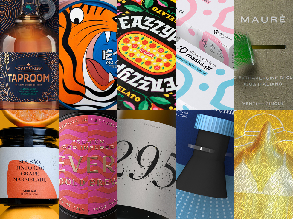

Packaging of the World presents the top 10 posts for the issue of #96. They are selected according to their post views, social shares, social likes, re-tweets repins and people reached. All these data were collected on this website and also on different platforms like our Instagram, Facebook and Pinterest page. These projects will definitely inspire you for your next design project, be sure to register/login to your account now to submit your latest packaging projects!

EAZZYPIZZY — PIZZA & GELATO by LESHA LIMONOV and EUGENE WISOTOW
The unique nature of EazzyPizzy is represented in its variety of taste combinations. Therefore, when designing the brand identity, we used a visual technique of contrast in order to emphasize the peculiarity of the brand. The branded pattern features a piece of pizza with orange, scoops of ice cream with tomato, melted cheese and sweet cream, strawberries and salts.

MASKS.GR by WE ARE TWO
Surgical masks are for everyone nowadays. Masks.gr creates high quality masks in a variety of colors.

WHAT TO EAT by BXL PACKAGING DESIGN
Leopards, tigers, and lions are very fierce beasts in nature. The designers used these three animals as the main images of the product, and the fierce expressions were re-drawn through humorous, comical, and fun techniques, cleverly combining the expressions of the beasts protecting food with the box opening method. When the box is rotated to take the food, it is like taking food from the tiger’s mouth, with a kind of danger of being swallowed by the tiger.

REVERIE – CBD INFUSED COFFEE by LUIS UTRILLAS
The main design challenge was to translate the dualism and balance of this unusual blend and make of it a relevant discriminator in a unique way. Contrasted balance ended up being our golden rule at the time of taking each decision.

NUDE SEEDS by COMMERSART
The trendy package design should confidently appeal to the buyer, “You’re right! I am exactly what you need!” Unmistakable authenticity, speaking plain and clear.
Yes, they are nude! We mean, sunflower seeds. No kidding. And since we are being serious here, we needed a truly compelling design, revealing the uniqueness of the product through emotions. That’s why we gave it a touch of humour.

FORTY CREEK TAPROOM by CBA DESIGN
The result is an identity that incorporates elements from the craft beer world and illustrations of hops, grains and barrels that tell the Taproom story in a unique and discoverable way that sets it apart from other Canadian whiskies.

295 by BACKBONE BRAND WONDERING
Designed a label in which the main graphic resource was the number of people who live in the town where these grapes grow. Located in the Sierra de Gredos with a total population of 295 people, of which 5 of them are in charge of discovering and making known this wine jewel.

MAURÈ by STEFBRAS
Maurè has always been in love with his lands, which he takes care of with infinite attention. There’s one thing he really doesn’t like: the “cudelle” (horsetail) that grows on the ground and that he punctually uproots with the trusty hoe.

SOGRAPE by MAFALDA PORTAL
Born out of love and appreciation of the land, this range of products shares the flavours and characters of all Sogrape terroirs. The story that paved the way to create these exceptional products is the same that led to the sourcing from unusual grape varieties and beautiful trees on Sogrape’s different estates — where biodiversity and sustainability play a meaningful role.

RAIN – HOSE ATTACHMENTS by ALINA LOMAEVA
The nozzles on the «RAIN» hose have a different degree of dispersion characteristic of natural rain. Some of them have a strong and hard pressure to water the trees, some are very soft so as not to damage fragile flowers. Due to this, each group of plants has its own nozzle.