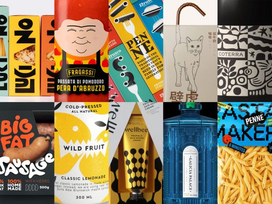
Let’s embark on an exhilarating journey into the captivating realm of Packaging of the World’s latest edition, Issue #114, where we unveil the crème de la crème, our top 10 posts. These selections are a testament to the harmonious blend of creativity and engagement that makes them stand out.
These designs aren’t just attention-grabbing; they’ve ignited a wildfire of excitement and inspiration across various platforms like Instagram, Facebook, and Pinterest. They’ve sparked a design revolution, attracting talented artists and enthusiasts from all corners of the globe.
And here’s your chance: don’t forget to either sign in or create an account to share your extraordinary packaging designs with us. Let’s keep the creativity flowing!
ETRUSCO PASTA by 3RD FLOOR
The argument is that pasta is essentially the same but for its shape, yet the shapes matter depending on the sauce used. 3RD FLOOR used unique geometric illustrations and a limited color palette to highlight pasta shapes, setting Etrusco apart from competitors who use a consistent color palette.
NEKO COFFEE by MAPKO
The design focuses on feline communication, particularly the cat’s tail, which communicates moods and intentions through different positions. The chosen tail positions convey a sense of calm and relaxation, reflecting the well-being customers experience in a Neko Café. This unique packaging merges the act of sipping coffee with the graceful movements of a cat’s tail.
PASTA LUCIANO by DISPENSER STUDIO
This packaging stands out thanks to its vibrant colors and bold, unconventional typography used for the brand and format names. These irregular characters, though unconventional, make a bold and memorable statement, reflecting the chef’s unique and unforgettable culinary spirit.
BUSY AS BEES by OHMYBRAND
The gift packaging resembles opening bee wings, cleverly connecting the product to its main ingredient, bee-glue, and creating a unique and special gift experience.
WILD FRUIT by BOLIMOND
The branding concept of “wild fruit” is brilliant because it evokes a sense of untamed, unexpected intrigue. It introduces a twist by portraying familiar fruits as playful fruit monsters, delivering an unexpected and delightful surprise.
PASTA MAKER by MARIA SAMOKHINA
The brand “PASTA MAKER” is designed to offer an experiential cooking journey. The name, logo, custom typeface, and brand identity were carefully developed to be expressive and modern. The custom font features pasta-like details for recognition
BIG FAT SAUSAGE by DALIBOR SMILESKI
The name “BIG FAT SAUSAGE” is bold and memorable, designed to catch your attention. In packaging design, standing out is crucial, and this brand achieves it with its unconventional name. It serves as a reminder that being a bit out of the ordinary can be effective in making your brand stand out.
TENUTA FRAGASSI by DISPENSER STUDIO
Giannino is more than just a mascot for Fragassi; he embodies the brand’s heart and soul. His personal touch is what sets this apart. Gianni’s dedication and passion make him the face of the brand, inviting customers to join his journey and taste his products with a warm smile. It’s all about forming a genuine connection between the creator and consumers.
COTE WEST by PAVEMENT
The black and white patterns go beyond aesthetics; they embody the winemaker’s craft, evoking the essence of hand-crafted linocut art. They symbolize the infusion of hands-on artistry from the winemaking process into the brand’s visual identity.
GALICIAN PALACE COLLECTION by LIONPENG DESIGN STUDIO
This Cuban rum draws inspiration from the ancient Galician Palace, reflecting the rich history of rum. The bottle design, inspired by the palace’s octagonal architecture, exudes a serene blue sea light, symbolizing Cuba’s coastal geography and its rum-making heritage.


